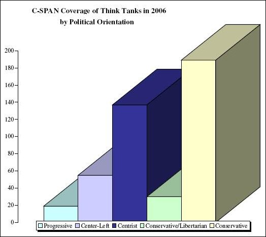
Stark & Scary Chart #2
by The Center for Economic and Policy Research (CEPR)

Note: The 1:10 bias... of the left (20) to the right (200).
→ Full article link here. ←
= = = = = = = = = = = = = = = < B e l o w T h e F o l d > = = = = = = = = = = = = = = =
Of course, if you happen to be in the top 1% of wealthy Americans, you could care less - right?


0 Comments:
Post a Comment
<< Home